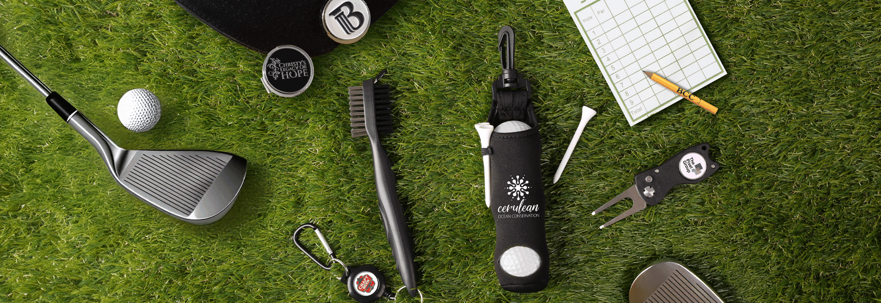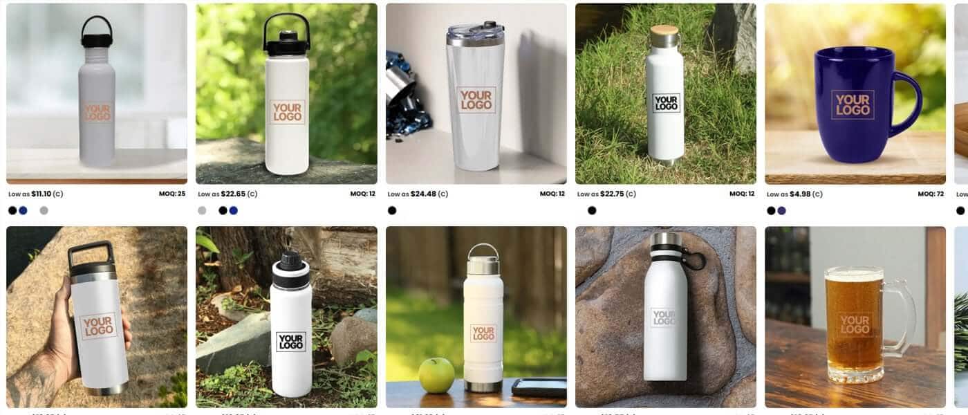
Table of Contents
- How to Stop Promotional Campaign ROI Fading Into The Background
- From Ideas to Impact: Why Decoration Drives Decisions
- Beyond The Brand - How Colour Can Create New Opportunities
- Different Environments: Why Full Colour Wins in All Places
- Owning the Desk: Why Full‑Colour Desk Accessories Build Brand Equity
- Walking Billboards: How Totes and Backpacks Multiply Impressions
- When Decoration Is About Personal Connection
- The Role of the Right Partner
- FAQs
How to Stop Promotional Campaign ROI Fading Into The Background
In promotional products, it’s easy to get pulled toward products and features. Products are tangible. They’re easy to compare. They’re easy to explain. And they’re often where conversations start. That instinct is natural....but it can also be misleading. Because while products are the vehicle, the brand impression, the imprint, is the value we actually deliver. How we decorate that product is what determines whether a campaign blends in or stands out.
Full‑colour branding can increase recognition by +80 to +90%
When decoration is treated as a secondary detail, campaigns blend in.
When decoration is treated as a strategy, brands stand out.
That’s why it’s so important to periodically reset our perspective. Decoration helps recenter attention on what clients are really trying to achieve: visibility, memorability, and brand equity in the real world.
From Ideas to Impact: Why Decoration Drives Decisions
March is when ideas take shape. April is when decisions get made. And that shift matters.
Early in the buying process, clients explore possibilities. They compare categories. They look at options. But as timelines tighten and budgets come into focus, the question changes.
It’s no longer “What should we buy?”
It becomes “How will my brand show up?”
That question is answered by how you decorate it.
Full-colour ads are read ~42% more often than monochrome versions
That’s where decoration becomes the conversion lever.
Clearly decorated products reduce uncertainty. It helps clients visualize the final impression. And when clients can clearly see how their brand will appear in the real world, saying yes becomes easier.
Beyond The Brand - How Colour Can Create New Opportunities
Most brand decisions are made for us before we start: the client’s brand colour often dictates the product colour, which in turn narrows how we can decorate it; especially when the goal is “match the brand exactly.” We've even built shopping tools around this reality; search-by-colour filters exist because buyers routinely start with brand colour first.

But brand colour doesn’t have to be a constraint.
With basic colour theory, especially complementary colours, we can keep the brand recognizable while shifting how the product is decorated when the moment calls for it. Complementary colours (colours opposite each other on the colour wheel) create the strongest contrast and make each other appear more vivid when paired.

Matrix 1: Strategy — Using Colour to Unlock New Campaign Opportunities
To make this practical, here’s a simple framework for thinking about colour strategically; not just as a brand constraint, but as a way to unlock new campaign opportunities.
| Brand Colour (Starting Point) | What It Signals | Complementary Colour (Contrast Lever) | Campaign Opportunity Unlocked |
|---|---|---|---|
| Blue / Navy | Trust, reliability, calm | Orange / Copper | Stable brand with a bold moment; launches, wins, milestones, or visual pop in muted environments |
| Teal / Aqua | Fresh, modern, balanced | Red / Coral | Warm up a clean or tech‑forward brand for hospitality, community, or engagement |
| Green | Growth, health, balance | Red / Pink | Turn wellness into celebration, momentum, or recognition‑driven campaigns |
| Yellow | Optimism, warmth, friendliness | Purple | Move from cheerful to premium, creative, or innovation‑led messaging |
| Red / Burgundy | Energy, urgency, passion | Green / Mint | Shift from urgency to growth, care, or renewal without losing brand recognition |
| Pink | Warmth, empathy, human connection | Green Family | Human‑centered campaigns (care, belonging, appreciation) or high‑energy pop with contrast |
In the promo world, contrast can applied through decoration and accent colours; not via full rebrands or complex visuals. Start with the client’s core brand colour as the product base or primary imprint, then introduce the complementary colour as a secondary visual lever to create focus, emotion, or a campaign “moment.”
- Product colour acting as the background for logos or messaging
- Accent features (lids, trims, zippers, grips)
- Full‑colour digital or sublimated decoration areas
- Packaging, bellybands or backer cards
Matrix 2: Application — Solving Client Challenges with Colour and Decoration
Here’s how those colour decisions show up when clients are trying to solve real campaign challenges.
| Client Goal | Colour Move (How to Get There) | Best Canvas (Where the Impression Lives) | Decoration Method That Supports the Outcome |
|---|---|---|---|
| Add life to a lackluster campaign | Add stock backgrounds and complementary accents | Any category where client art is weak or rushed | Stock art libraries and concierge‑level design support (logo in → wow out) |
Tell a bigger story with the brand | Secondary palette, patterns, and copy blocks | Packaging, bellybands, and backer cards | Full‑colour print on inserts and backers = double‑sided space for narrative |
Be noticed in public | High‑contrast imprint on a light or neutral base (white cotton works especially well) | White cotton totes and backpacks | Full‑colour digital or transfer for visibility. Simple backgrounds for distance readability |
| Create delight and lift mood | Brand‑matched colours with warm accent tones | Colourful candy with coordinated packaging | Full‑colour print on packaging elements, and/or coordinated candy colour matching |
| Make it a logo the center of attention | Go full colour, or add a complimentary coloured background | Auto accessories in monochrome interiors | Full‑colour digital for vivid pop, or 1–2 colour screen print for a bold signal |
| Stay visible longer | Full‑field palette using brand colour plus complementary accents or patterns | Full‑colour mouse mats and desk surfaces. Own the desk. | Sublimation for edge‑to‑edge impact, or Digital printing for detailed graphics |
Different Environments: Why Full Colour Wins in All Places
Life is busy and full of advertisements everywhere we look. On bus stops, billboards, Instagram ads, television, and even at your kid's soccer games. We are bombarded with brands around every corner we take. How can you boost your brand in an already chaotic advertising environment with a promotional product?
The answer is easy. Introduce a full‑colour branded accessory into that environment, and your brand moves from a basic product to an elevated branding experience ready to compete with all the other ads. The way it’s decorated suddenly matters more than the product itself. Suddenly, your logo is competing in the chaos and standing out with your full colour design.
Here's a stat for you. Full-colour ads are read ~42% more often than monochrome versions. This proves that adding pops of colour to your branded merch will likely help your brand be seen, read, and remembered.
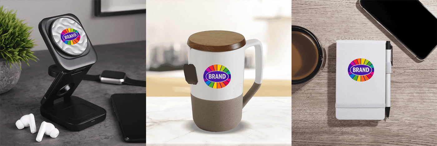
Owning the Desk: Why Full‑Colour Desk Accessories Build Brand Equity
Few environments matter more than the desk.
People spend hours there every day. It’s where work happens, where ideas form, and where thoughtful brands live quietly in the background of daily routines, like a trusted colleague or a supportive friend.
A full‑colour decorated phone charger, notebook, or pen doesn’t just sit on a desk; it defines it.
For employees, it creates familiarity, belonging, and visual cohesion. For customers, it reinforces brand presence in a space associated with productivity and trust.
Colour matters here. Vibrant, intentional branding energizes the space. It subtly influences mood, engagement, and perception.
Walking Billboards: How Totes and Backpacks Multiply Impressions
Some items don’t stay put, and that’s exactly the point.
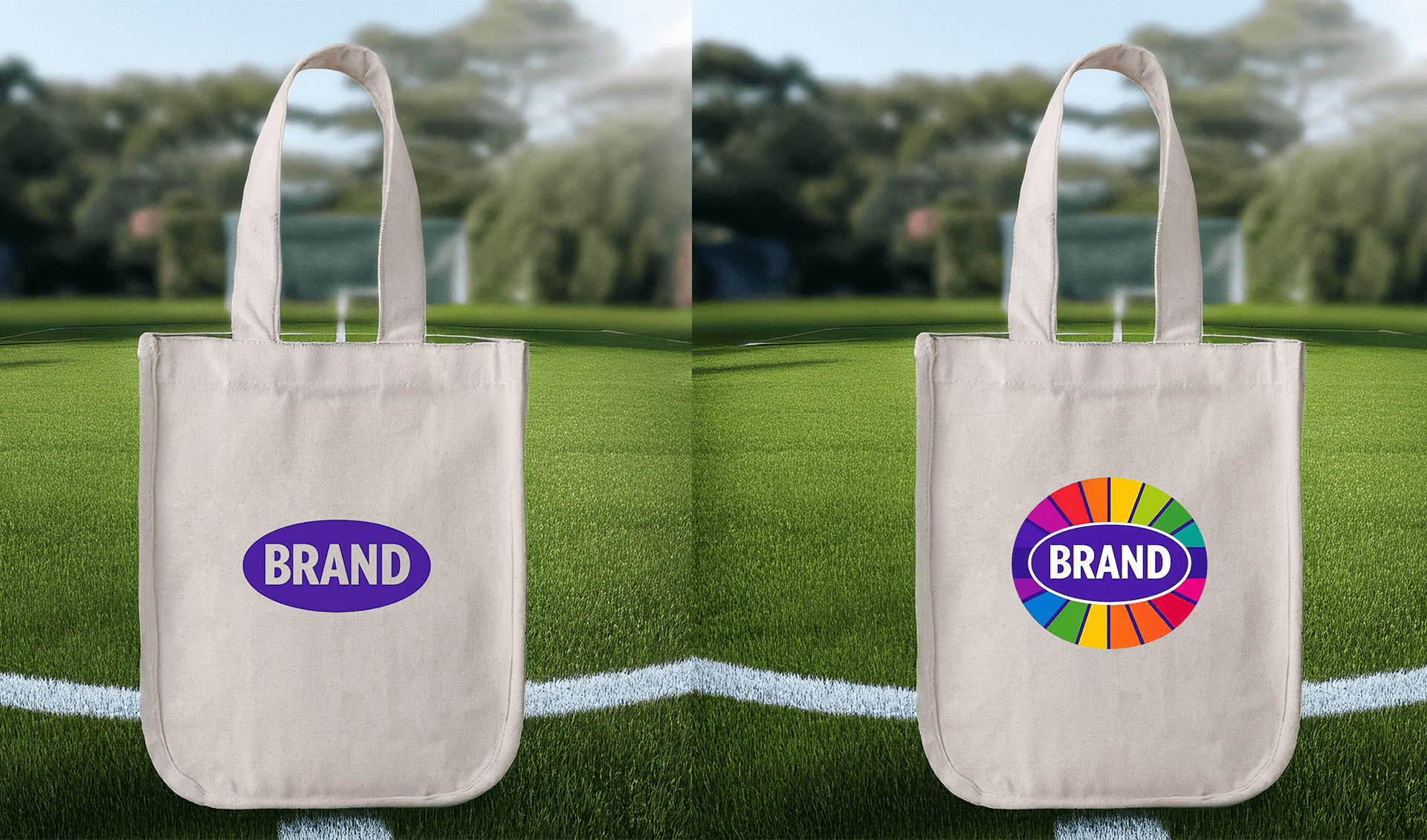
White cotton totes and backpacks with bold full‑colour decoration turn everyday movement into brand amplification. They don’t live in one environment; they travel.
Each outing becomes a new impression. Each public appearance becomes unpaid media.
The simplicity of a white base combined with a confident, full‑colour imprint gives brands clarity at a distance. The logo isn’t buried; it leads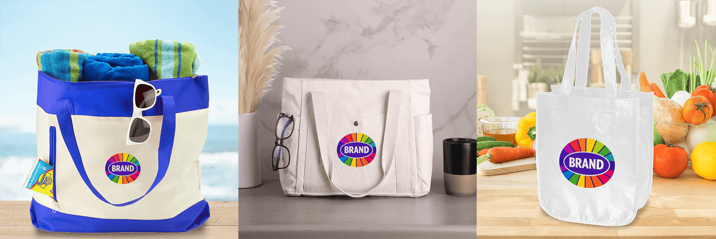
When Decoration Is About Personal Connection
Most promotional decoration is designed for scale, connecting brands to large audiences through visibility and repetition.
This is different.
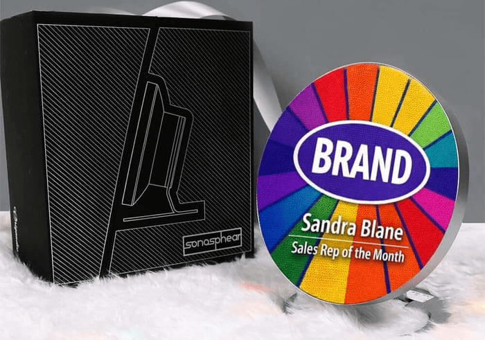
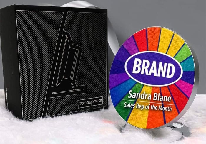
Here, decoration enables a one‑to‑one connection. With a MOQ of 1 and stunning, edge‑to‑edge digital full‑colour printing, the imprint isn’t an afterthought, it’s the entire surface. The large, dedicated imprint area allows every piece to be designed intentionally, around a person or a moment, not a template.
That level of decoration goes beyond standard personalization. It moves past names and titles into full visual storytelling, made possible because the decoration is created as a single, uninterrupted piece.
And because the result is something people actually use - not just display - the recognition lasts. Each interaction reinforces the moment, the message, and the brand.
This is decoration‑first thinking at its most intentional. When decoration is treated as the starting point, not the finishing touch, it fundamentally changes what a promotional product can be. The imprint doesn’t get added to the item — it defines it.
By designing around a single person, a specific moment, or a meaningful story, decoration becomes the value itself. The result is high impact without scale, memorability without noise, and recognition that feels earned rather than forced. Decoration, at its best, doesn’t speak to everyone. It speaks directly to someone, and that’s what makes it last.
The Role of the Right Partner
Great decoration doesn’t happen in isolation.
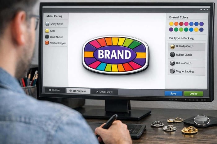
The right supplier partner can help you decorate to elevate an ordinary campaign into a memorable one, whether that’s through stock art that removes friction or design services that ensure logos are looking their best.
For distributors, this partnership expands what’s possible. It means fewer compromises, stronger visuals, and better outcomes for clients.
Decoration strategy scales best when creativity, execution, and speed work together.
Matrix 3: Execution — Choosing the Right Decoration to Deliver the Impression
| Decoration Method | What It Does Visually | Colour / Brand Constraints to Acknowledge | Best Use with Complementary Colour Strategy |
|---|---|---|---|
| Laser Engraving | Subtle, permanent, premium finish driven by material contrast | Not a colour‑forward method; visual impact comes from the product material itself | Use colour strategically through product choice and packaging, while laser adds restraint, durability, and authority |
| Screen Print (1–2 Spot Colours) | Clean, bold, highly legible decoration with strong contrast | Limited colour range; prioritizes clarity and impact over detail | Perfect for high‑contrast complementary pairs (blue/orange, yellow/purple) that need to read instantly from a distance |
| Full‑Colour Heat Transfer | Vivid full colour applied to a wide range of substrates | Texture and feel can vary by product; important to set expectations | Useful when you need a bold complementary pop on products that can’t be directly printed or sublimated |
| Full‑Colour Digital (CMYK) | Photo‑quality detail, gradients, and complex artwork | PMS colours are often approximated in CMYK; strongest visibility comes from light or white product bases | Ideal for subtle complementary accents, patterns, and backgrounds that shift mood without changing the core logo |
| Sublimation | Embedded, edge‑to‑edge colour that becomes part of the product itself | Requires compatible substrates (typically polyester or coated surfaces) | Best for “own‑the‑surface” moments where the background palette tells as much of the story as the logo |
Pride: A Case Study in Decoration‑Led Impact
Pride is not a niche moment in the promotional calendar; it’s a major, spend‑driven activation window where the decorated product carries the message.
Across North America, Pride celebrations generate hundreds of millions of dollars in combined economic activity each year, fueled by large‑scale parades, festivals, corporate sponsorships, and brand activations in major cities. Much of that investment shows up visually, through branded merchandise, apparel, signage, and giveaways that fund events, signal participation, and create shared experiences.
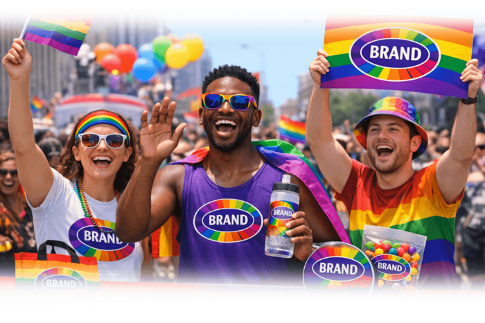
Unlike many promotional moments, Pride is inherently visual. Colour is not optional—it’s symbolic. Visibility, representation, and authenticity are communicated almost entirely through decoration choices: full‑colour imprints, large imprint areas, coordinated palettes, and consistent execution across decorated products.
On the promotional products side, Pride‑related merchandise has historically driven significant seasonal demand. While exact dollar totals are not publicly disclosed, ASI Research shows that Pride‑related promo product searches peaked in 2023, then declined by 50%+ by 2025, reflecting a shift away from surface‑level “rainbow” product toward more intentional, meaningful decoration choices. This makes the decoration strategy more important, not less.
Pride doesn’t succeed because of the product alone. It succeeds because decoration transforms spending into visibility, and visibility into meaning.
Need help getting started? Get free Pride stock art!
FAQs
Why does decoration matter more than the promotional product itself?
Decoration determines how a brand is perceived in the real world. While products are the vehicle, decoration controls visibility, memorability, and emotional impact. A thoughtfully decorated product stands out, communicates intent, and builds brand equity long after the moment of distribution.
What does it mean to decorate promotional products strategically?
To decorate strategically means designing the imprint, color, and placement intentionally based on environment, audience, and campaign goals. Instead of treating decoration as a finishing touch, it becomes the driver of recognition, clarity, and brand recall.
How does full‑color decoration improve promotional campaign ROI?
Full‑color decoration increases visibility and recognition, especially in muted or monochrome environments. When a product is clearly and confidently decorated, it reduces decision friction for buyers and makes the brand stand out in everyday use, extending the lifespan and impact of the campaign.
When should brands use complementary colors instead of strict brand colors?
Complementary colors are most effective when a campaign needs emphasis, contrast, or emotional shift—such as launches, recognition, events, or seasonal moments. Brands can stay recognizable while using complementary accents to decorate products in a way that signals energy, care, celebration, or innovation.
What types of promotional products benefit most from decoration‑first thinking?
Products that live in daily environments benefit the most—desk items, auto accessories, bags, packaging, and personal awards. These items gain value when decorated intentionally because repeated exposure builds familiarity, trust, and long‑term brand presence.
Can scent, color, and taste work together to improve brand recall?
Candy activates multiple senses at once—color through sight, scent through smell, and flavor through taste. Research shows that adding an extra sensory cue like scent or taste increases brand recall in 84% of consumers. When candy is intentionally decorated to align these sensory elements with a brand’s visual identity, it creates a stronger emotional memory than visual branding alone, making the brand easier to remember and more positively associated over time.